
Quick Answer
Backrooms is a horror triumph because it treats production design itself as the antagonist: 30,000+ sq ft of physical sets turn endless fluorescent-lit corridors into a monster more disturbing than anything with teeth. It draws clear lines to The Shining, The Blair Witch Project, Stranger Things and Poltergeist, and works best when it trusts empty rooms over exposition.
This review contains limited discussion of the film’s premise and visual ideas but avoids revealing its major final twists.
Key Takeaways
- Backrooms turns production design into the film’s true antagonist, not just its backdrop.
- More than 30,000 square feet of physical sets were built so the camera could travel through real, contiguous space.
- The film’s clearest ancestors are The Shining, The Blair Witch Project, Stranger Things and Poltergeist.
- Osgood Perkins produced (alongside James Wan and Shawn Levy); director Kane Parsons is the clear authorial voice.
- The film is strongest exploring empty rooms and weakest when it becomes a conventional chase.
Backrooms Is a Triumph of Production Design
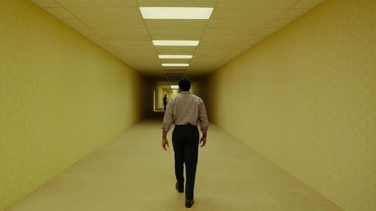
The most striking thing about Backrooms is not its creature, mythology or internet origins. It is the extraordinary confidence with which the film turns production design into the principal source of horror.
The film’s endless corridors, stained carpets, ceiling grids, fluorescent tubes and sickly yellow walls are immediately recognisable. They resemble offices, hotels, storage facilities, waiting rooms, furniture showrooms and institutional spaces, yet they never settle into one identifiable location. Everything feels familiar, but nothing feels correct.
That contradiction is the film’s greatest hook.
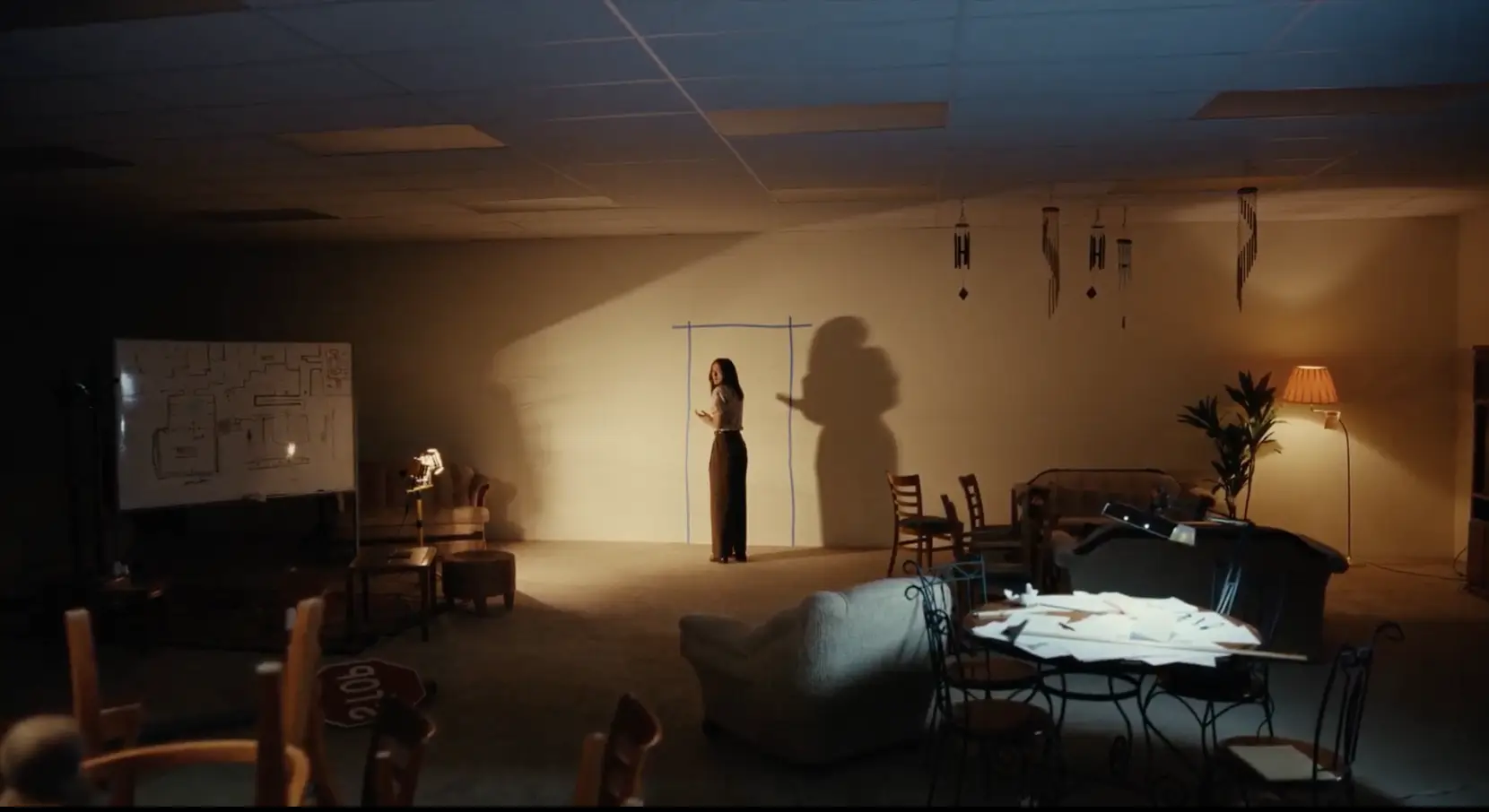
Backrooms understands that production design is not merely a way of creating an attractive environment around the actors. The environment is the antagonist. It controls movement, denies orientation and gradually weakens the characters’ certainty about where they are and whether the physical world still follows dependable rules.
Director Kane Parsons and production designer Danny Vermette do not decorate the Backrooms with conventional Gothic detail. There are no cobwebbed staircases, ancient portraits or obvious symbols of death. Instead, they find terror in suspended ceiling tiles, corporate carpet patterns, plastic wall panels and anonymous architectural repetition.
The film reportedly constructed more than 30,000 square feet of physical Backrooms sets for the production. That decision is visible on screen. The actors are not simply performing against abstract digital backgrounds; they appear physically contained by the spaces around them. The scale of the build allows the camera to travel, turn corners and reveal new architectural contradictions without the environment feeling weightless. (Wikipedia)
Did You Know?
The production reportedly built more than 30,000 square feet of physical Backrooms sets, allowing the camera to travel and turn corners through real, contiguous space instead of compositing digital backgrounds.
It is a brilliant example of how strong art direction can become a film’s primary piece of intellectual property.
A Familiar Place That Has Forgotten Its Purpose
The central horror of the Backrooms is that the space appears to have been designed for people, but it no longer has a clear human purpose.
A room normally communicates its intended function. A bedroom contains a bed. A kitchen provides somewhere to prepare food. A cinema points its seats towards a screen. Even an office corridor is expected to connect recognisable working areas.
The Backrooms remove those signals.
A corridor may lead to another identical corridor. A room may contain several openings but no indication of which direction represents progress. The architecture continually suggests that somewhere useful must exist just out of sight, yet the search for that destination only produces more space.
This is where the film moves beyond the novelty of recreating the viral internet aesthetic. The Backrooms are frightening because they resemble a memory of architecture rather than architecture itself: an imperfect reconstruction created by something that understands the visual ingredients of human environments but not why humans built them.
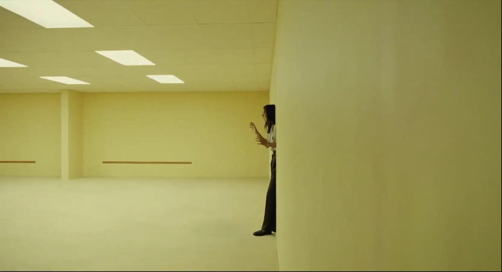
A wall turns where it should continue. A staircase promises vertical progress but leads into another variation of the same visual system. A domestic space appears inside an institutional one. Scale shifts unexpectedly. The environment seems to be observing reality and copying it incorrectly.
That is far more disturbing than simply placing a monster inside a maze.
The production design creates the sense that the world itself is malfunctioning.
The Shining and the Impossible Architecture of Fear
The clearest cinematic comparison is Stanley Kubrick’s The Shining.
The Overlook Hotel is frightening before Jack Torrance becomes fully dangerous because its architecture cannot be trusted. Corridors appear to extend beyond the physical boundaries of the building. Rooms and windows occupy positions that do not make logical sense. The hotel feels coherent when viewed one shot at a time, but impossible when mentally assembled.
Kubrick used that geographical uncertainty to destabilise the audience. We believe we understand what a hotel is, but the Overlook quietly rejects our attempts to map it.
Backrooms develops the same idea on a far greater scale.
The Overlook still performs the role of a hotel. It has bedrooms, kitchens, a ballroom and service corridors. The Backrooms have been stripped of even that functional reassurance. Their spaces repeat the visual language of commercial architecture without providing a destination.
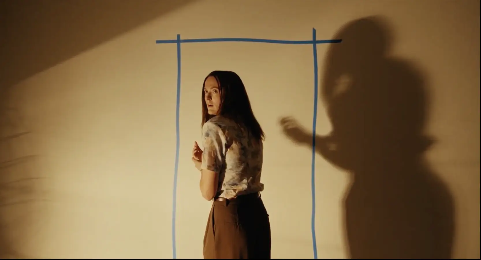
Both films also use symmetrical compositions and slow camera movement to suggest that the environment is controlling the frame. The characters appear temporarily permitted to occupy these spaces rather than truly inhabiting them.
In The Shining, Danny’s tricycle journeys teach the audience the visual rhythm of the Overlook. The alternating sound of wheels moving across hard flooring and carpet makes us conscious of every threshold. Each corner might reveal nothing, the twins or an image that breaks the logic of the hotel.
Backrooms creates a similar anticipation. Corners become editing points inside the physical environment. Every turn promises a revelation, but the most disturbing possibility is often another empty room.
The fear comes not only from what may appear, but from the possibility that the architecture will continue forever.
The Backrooms do not simply contain the horror. They are the horror.
The Blair Witch Project and the Horror of Failed Navigation
The film also owes a clear debt to The Blair Witch Project, particularly in its treatment of navigation.
In The Blair Witch Project, the forest does not need to transform visibly. The characters walk, consult their map and attempt to maintain a direction, yet continually find themselves returning to familiar spaces. The landscape destroys their confidence through repetition.
The terror is not simply that they are lost. It is that the normal methods of becoming unlost no longer work.
The Backrooms operate according to the same principle. Characters attempt to remember routes, identify landmarks and impose patterns upon the environment, but the space resists being reduced to a map.
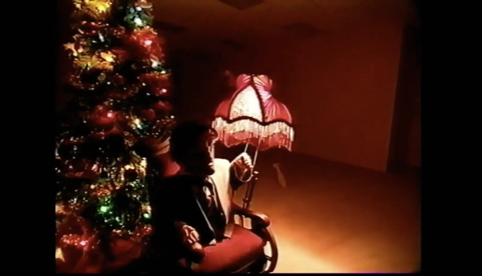
Parsons’ original YouTube work also helped popularise a form of analog and found-footage horror in which the recording itself becomes evidence of an impossible event. That influence remains present in the feature, even as the film expands beyond the visual limitations of a single recovered tape. The result preserves the feeling that we are witnessing material never intended for public viewing, but combines it with the scale and control of a fully designed feature production. The feature grew from Parsons’ viral online series, which he began creating as a teenager using Blender and Adobe After Effects. (Wikipedia)
The comparison with Blair Witch is also important because both films understand that withholding information can generate more fear than explanation.
A weaker adaptation of the Backrooms concept might have spent much of its running time cataloguing levels, monsters and rules. Parsons is more interested in the experience of being inside the environment. The film offers mythology, but its strongest passages retain the primitive anxiety of not knowing where the next corridor leads.
Stranger Things and the Corrupted Reflection of Reality
The relationship to Stranger Things is most apparent in the idea of a parallel environment that reflects familiar reality while corrupting it.
The Upside Down reproduces recognisable places, but transforms them through decay, darkness and organic contamination. A family home, school or public building remains geographically familiar while becoming physically hostile.
The Backrooms are less obviously organic, but they create a related sensation. The environments appear to have been derived from human memory and commercial design, then emptied of social purpose. Instead of covering our world with vines and spores, they reconstruct it as a sequence of architectural approximations.
Both works also create horror from crossing an apparently ordinary threshold. A wall, doorway or damaged surface can become an entrance into another system of reality. Once that boundary is crossed, returning is not simply a matter of walking backwards through the same door.
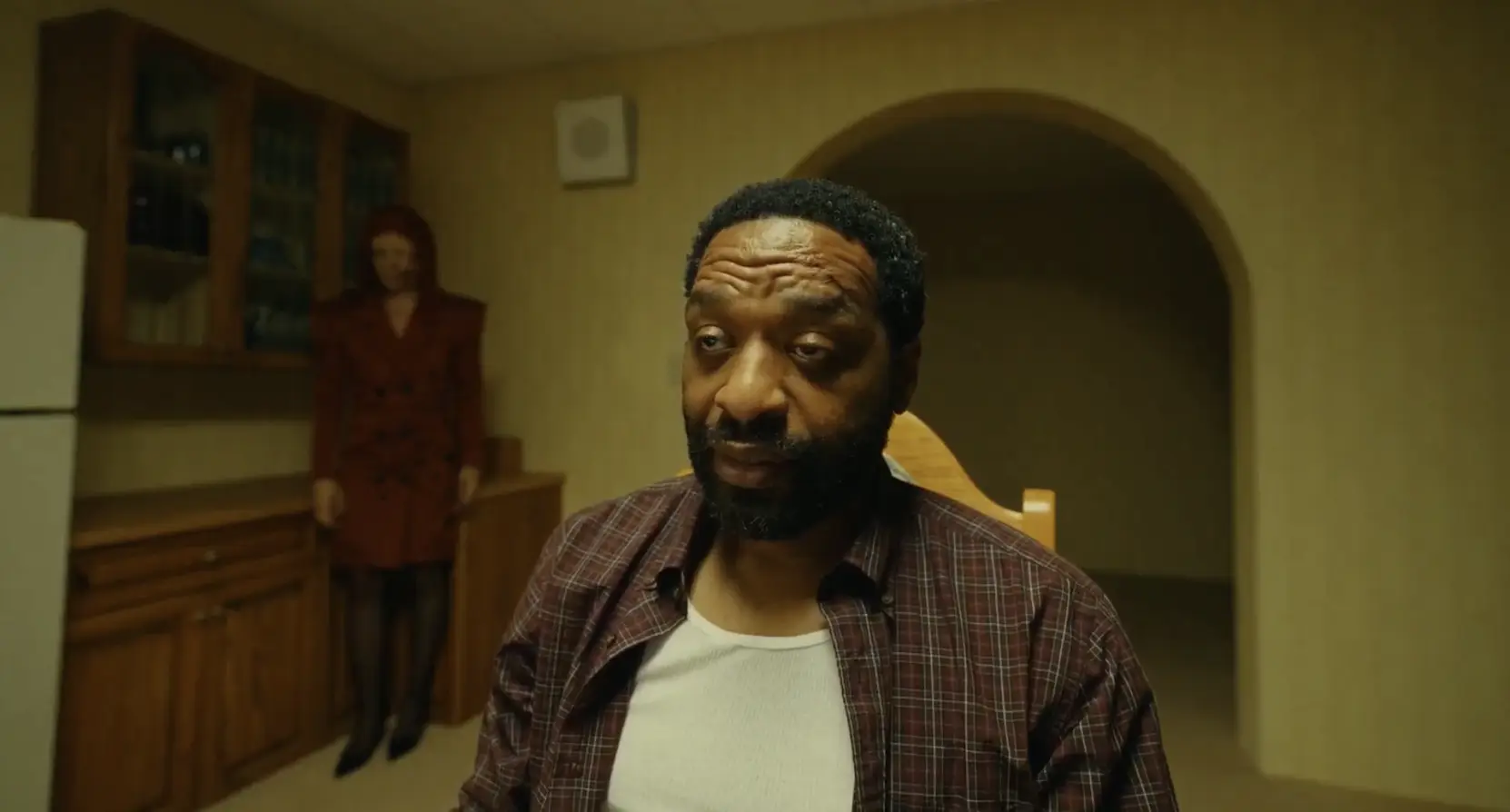
Yet Backrooms is colder than Stranger Things. The Upside Down often feels predatory and alive. The Backrooms can feel indifferent. They do not always appear to be attacking the characters; they may simply be continuing, endlessly and without concern for the human beings trapped inside them.
That indifference gives the film its existential quality.
The characters are not necessarily important to the space. They may be temporary errors moving through a structure too large to notice them.
Poltergeist and the Terror Beneath Commercial Suburbia
The connection to Poltergeist comes through the corruption of commercial and domestic security.
Poltergeist begins in a planned suburban community whose homes, televisions and consumer comforts suggest order. The horror emerges from the discovery that the environment has been built over something unresolved and that the apparently safe home contains entrances into another dimension.
Backrooms similarly locates the impossible beneath a furniture showroom — a place devoted to selling idealised versions of domestic comfort. Sofas, beds, tables and room displays are supposed to help customers imagine secure and attractive homes. Beneath that commercial surface lies an endless environment in which the concept of home has been copied but emptied of warmth.
This is one of the film’s smartest visual ideas.
A furniture showroom already contains artificial rooms. It presents living spaces without the lives that would normally give them meaning. Walls may not connect to ceilings, windows may look onto nowhere and bedrooms may sit a few metres from dining rooms belonging to completely different imagined houses.
The showroom is therefore already a controlled simulation of domestic reality.
The Backrooms feel like that logic extended infinitely.
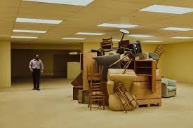
This creates a powerful thematic bridge between consumer architecture and supernatural space. The characters enter a world made from the visual remains of human environments, just as Poltergeist turned the ordinary family home into a place where walls, cupboards and television screens could no longer be trusted.
How Backrooms compares to its clearest influences
| Film | Shared Idea | Key Difference |
|---|---|---|
| The Shining | Untrustworthy, maze-like architecture | The Overlook still functions as a real hotel; the Backrooms don’t function as anything |
| The Blair Witch Project | Navigation itself becomes the horror | Blair Witch uses a real forest; Backrooms uses built, repeating interiors |
| Stranger Things | A parallel world that mirrors and corrupts ours | The Upside Down feels alive and predatory; the Backrooms feel indifferent |
| Poltergeist | Danger hidden beneath ordinary commercial/domestic space | Poltergeist corrupts a home; Backrooms corrupts a furniture showroom |
Osgood Perkins and the Value of Restraint
Osgood Perkins‘ involvement as one of the film’s producers is significant, even though Backrooms remains clearly Kane Parsons’ film. Perkins has built his directorial identity around atmosphere, negative space, carefully controlled compositions and the fear produced by information that remains just beyond the audience’s understanding. He was among the film’s credited producers alongside figures including James Wan and Shawn Levy. (Wikipedia)
Films such as The Blackcoat’s Daughter and Longlegs demonstrate Perkins’ interest in environments that feel spiritually contaminated before the narrative fully explains why. His frames often invite the viewer to examine doorways, dark areas and empty portions of the image, waiting for something that may already be present.
That sensibility is compatible with the Backrooms concept.
The film is strongest when it resists the temptation to overpopulate its spaces. An empty corridor becomes frightening because the composition encourages us to search it. A distant shape may be an architectural feature, a person or something that has learned to resemble one.
Parsons shares Perkins’ understanding that horror can be generated through duration. A frame becomes uncomfortable when it remains on screen long enough for the viewer to move beyond simple recognition and begin imagining possibilities.
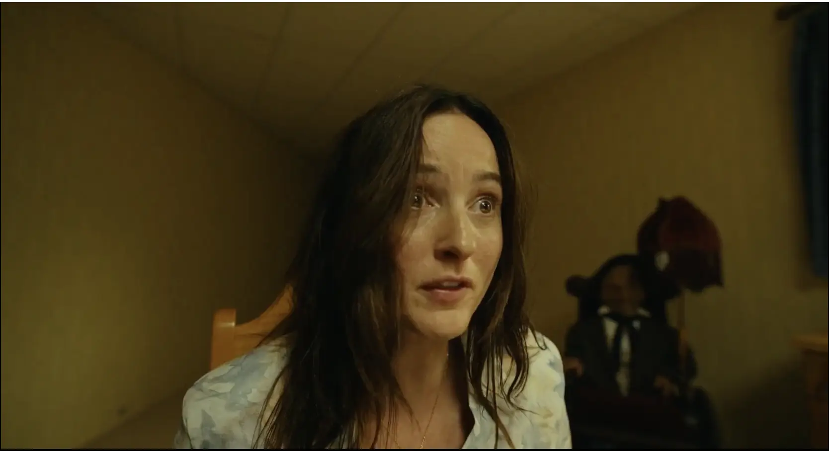
Perkins’ producing presence should not be overstated as evidence that he directed the film from behind the scenes. Parsons’ authorship is clear, particularly in the relationship between analog imagery, digital culture and liminal architecture. But the partnership makes creative sense. Both filmmakers recognise that dread often begins before the audience can explain what it is seeing.
Pro Tip for First-Time Viewers
Watch this one with the lights off and the volume up. The film’s best moments are long, quiet held shots of empty rooms — the kind of horror that rewards patience rather than jump-scare reflexes.
The Production Design Is More Important Than the Monster
Many horror films are marketed around the reveal of their creature. Backrooms is more interesting because its most memorable creation is the environment itself.
The film does contain physical threats, but the Backrooms would remain frightening without them. In fact, some of the most effective sequences involve little more than a character entering a space and attempting to understand its dimensions.
This is where Danny Vermette’s production design becomes so important. The walls are not merely yellow; they exist within a carefully controlled range of sickly institutional tones. The carpets are patterned enough to feel designed but never distinctive enough to become useful landmarks. The fluorescent lighting appears functional while creating no sense of comfort or natural time.
Every design decision supports disorientation.
The Backrooms must be monotonous without becoming visually monotonous for the audience. That is a difficult balance. If every room were genuinely identical, the film would quickly become dramatically flat. If every room were wildly different, the central concept of repetition would disappear.
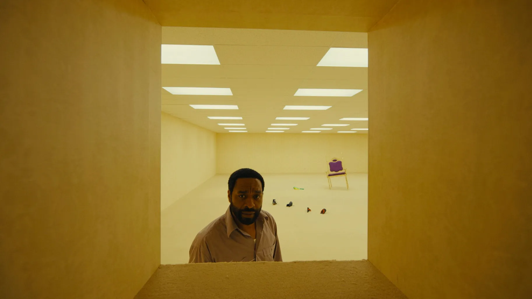
The designers solve this by creating variations within a coherent visual language. Ceiling heights change. Corridors narrow or widen. Domestic, industrial and commercial forms begin to bleed into one another. The world evolves while retaining the sense that it was generated by the same flawed architectural intelligence.
One review described the film’s production design as “controlled ugliness,” which captures the achievement well: the spaces are intentionally banal, but the filmmaking is never visually careless. (The Jam Report)
The ugliness is authored.
Kane Parsons Understands the Original Hook
The risk in adapting an internet phenomenon is that the feature film will explain away the quality that made the original compelling.
The early Backrooms image worked because almost nothing was known about it. The viewer was given an empty yellow space and the suggestion that someone had accidentally fallen outside the normal boundaries of reality.
That is enough to activate the imagination.
Parsons understands that the concept is not simply “a maze with creatures.” Its deeper appeal lies in the fear of entering a place that seems to remember humanity without containing human life.
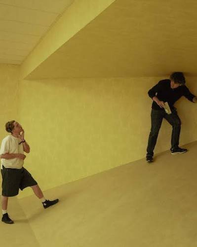
The film expands the idea through characters, a wider narrative and major physical production, but it repeatedly returns to that original sensation. A person stands inside a room that should make sense and realises that it does not.
For a filmmaker making his feature debut at such a young age, Parsons demonstrates remarkable visual assurance. The film is not flawless, and its mythology occasionally competes with the purity of its premise. The more information a horror film provides, the harder it becomes to preserve the terror of the unknown.
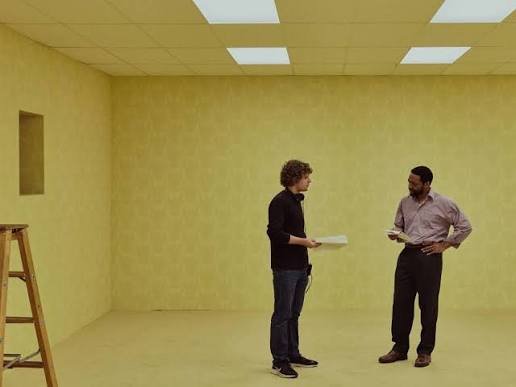
However, the strength of the visual world carries the film through its more complicated narrative passages. Parsons knows how to compose emptiness, how to delay a reveal and how to make a static architectural feature feel threatening.
That is not simply internet fluency. It is direction.
Where Backrooms Is Less Effective
The film is at its strongest when the characters are exploring, listening and attempting to understand the environment. It becomes more conventional whenever the Backrooms are reduced to a location through which people must run while being pursued.
This is a familiar tension in modern horror. Atmosphere attracts the audience, but narrative escalation often demands increasingly visible danger. Once a threat has been clearly identified, framed and explained, part of its power inevitably disappears.
The human story is necessary because a feature cannot survive entirely as an architectural demonstration. Chiwetel Ejiofor and Renate Reinsve give the film emotional seriousness, preventing the characters from feeling like anonymous figures moving through an elaborate installation. Parsons also uses the central relationship to connect the impossible environment to guilt, memory and psychological fracture.
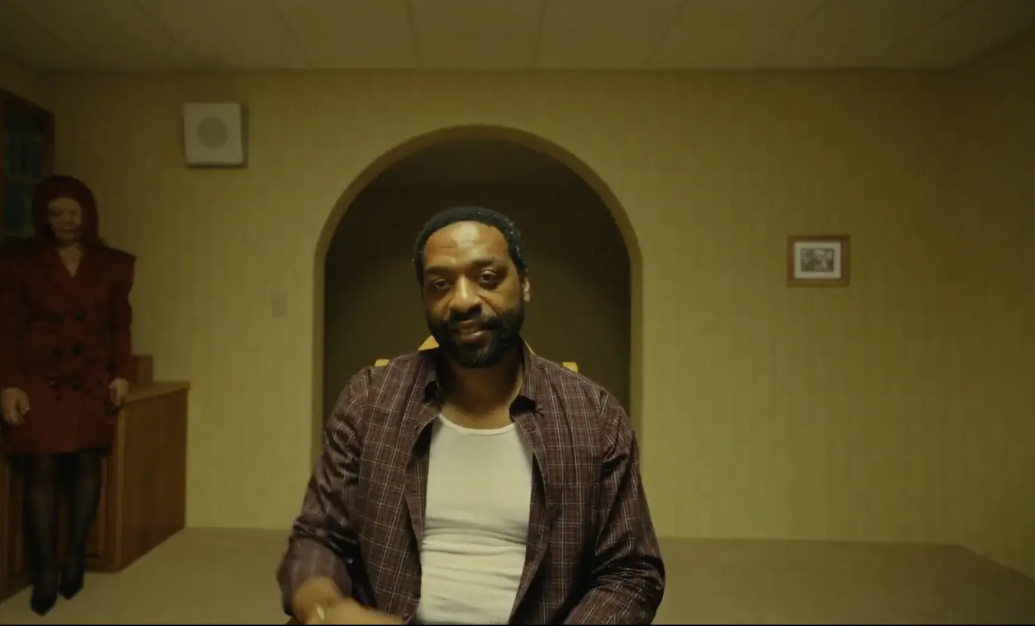
Even so, there are moments when the film’s desire to provide narrative machinery is less compelling than the simple act of opening another door.
That is not a fatal weakness. It is evidence of how powerful the central environment is. The art direction creates such a compelling form of fear that conventional plot mechanics can feel less interesting by comparison.
Heads Up
If you’re going in expecting a monster-first creature feature, temper your expectations — the chase sequences are the film’s least distinctive passages. The atmosphere is the main event.
A New Generation’s Shining?
Calling Backrooms a new generation’s The Shining would be too simplistic, but the comparison points towards what makes the film culturally significant.
Both films understand that architecture can hold psychological power. Both create spaces that cannot be reliably mapped. Both make empty corridors feel observant. Both use production design not merely to illustrate the story, but to determine how the story is experienced.
The difference is generational.
The Overlook Hotel comes from the architecture of institutional luxury: grand corridors, formal carpets, ballrooms and an accumulated historical past. The Backrooms come from late twentieth-century commercial anonymity: offices, showrooms, suspended ceilings, fluorescent lighting and spaces designed to be used without being remembered.
One is haunted by history.
The other feels haunted by the absence of history.
For audiences raised around shopping centres, office parks, multiplayer game environments, abandoned retail units and digitally generated spaces, the Backrooms offer a recognisable modern nightmare. They represent the fear that behind the designed surfaces of everyday life lies an infinite system with no human purpose.
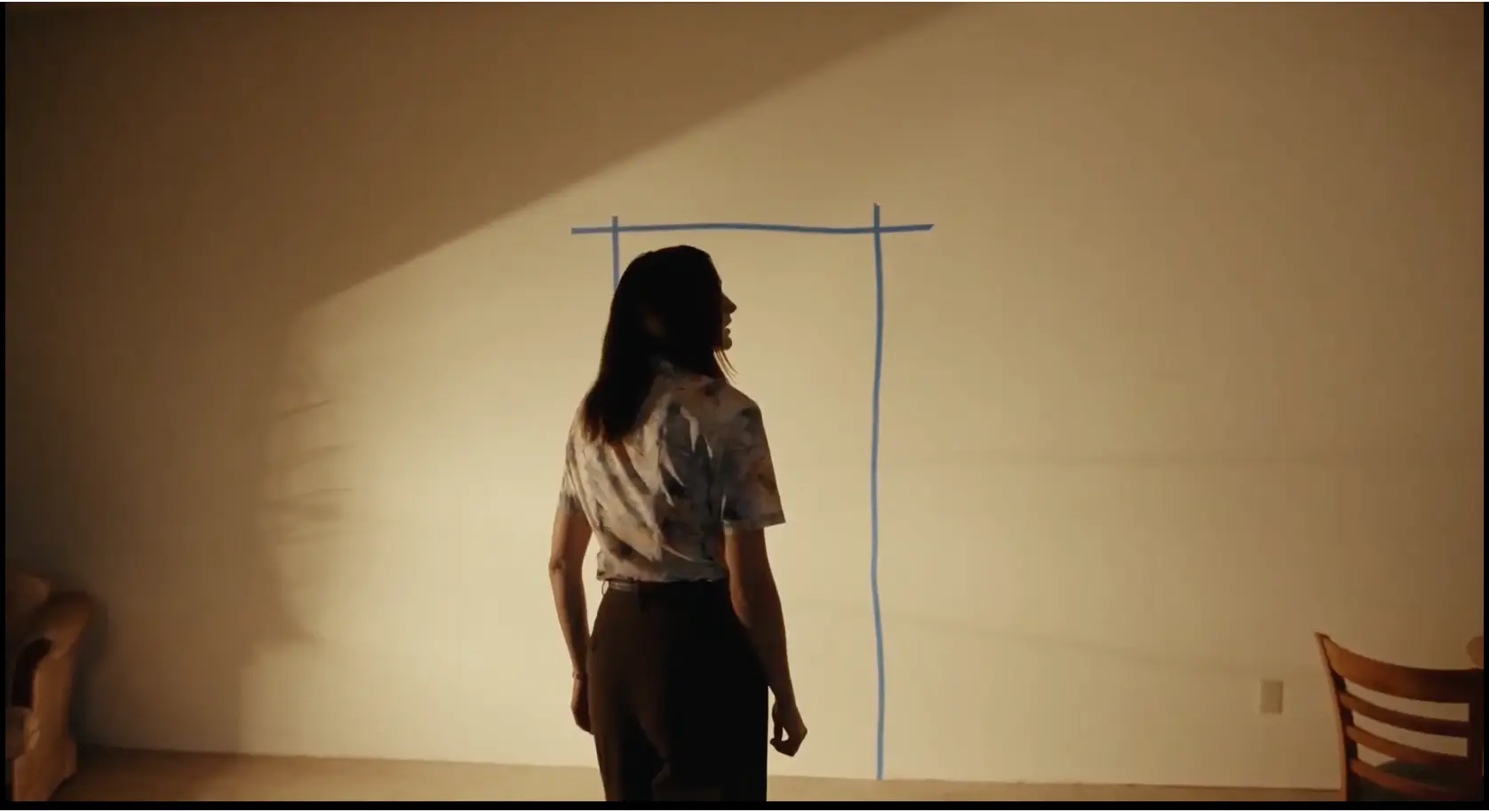
Final Verdict
Backrooms is a reminder that great horror does not always begin with a monster. Sometimes it begins with wallpaper, carpeting, fluorescent lighting and a doorway positioned where no doorway should exist.
As a piece of production design, the film is exceptional. Its sets create scale, atmosphere and a visual identity powerful enough to exist beyond the plot. The influence of The Shining can be felt in its impossible architecture, while The Blair Witch Project echoes through its failed navigation and analog-horror language. Stranger Things and Poltergeist provide useful parallels in their corrupted reflections of familiar spaces, while Osgood Perkins’ producing involvement feels appropriate for a film so committed to composition, restraint and sustained dread.
Most importantly, Kane Parsons has not treated art direction as decoration.
He has treated it as story, character, mythology and threat.
The Backrooms do not simply contain the horror.
The Backrooms are the horror.
Frequently Asked Questions
No. It originated as an internet “creepypasta” / liminal-space image macro before Kane Parsons expanded it into a viral analog-horror web series and, eventually, this feature film.
Kane Parsons directed the film, expanding on the YouTube series he began creating as a teenager using Blender and Adobe After Effects. Osgood Perkins produced alongside James Wan and Shawn Levy.
The film’s official marketing lists a theatrical release date of May 29, via A24.
It discusses the film’s premise, tone and visual ideas in detail but avoids revealing the movie’s major final twists.
Where to Learn More
Blood Star demonstrates how careful planning, strong performances and real locations can help independent filmmakers achieve remarkable results on limited resources.
If you’d like to learn more about the film, its production and cast, visit the official Blood Star website.
Ready to see these filmmaking techniques in action?
Visit the Blood Star Watch Page to find out where the film is currently available to watch.

Table of Contents
- Backrooms Is a Triumph of Production Design
- A Familiar Place That Has Forgotten Its Purpose
- The Shining and the Impossible Architecture of Fear
- The Blair Witch Project and the Horror of Failed Navigation
- Stranger Things and the Corrupted Reflection of Reality
- Poltergeist and the Terror Beneath Commercial Suburbia
- Osgood Perkins and the Value of Restraint
- The Production Design Is More Important Than the Monster
- Kane Parsons Understands the Original Hook
- Where Backrooms Is Less Effective
- A New Generation’s Shining?
- Final Verdict
- Where to Learn More